The 'Stock' Exchange
Kaufmann & Strauss Co. "Standard of Perfection"
Kaufmann & Strauss Co. "Standard of Perfection"
Click the Picture
to Return to K&S Stock Catalog Page
to Return to K&S Stock Catalog Page
Date: Pre-pro
Size: 13"
Style: Inverted Pie
Scarcity: Common
Value: $$$ to $$$$
Condition & Brewer Dependent
Size: 13"
Style: Inverted Pie
Scarcity: Common
Value: $$$ to $$$$
Condition & Brewer Dependent
Confirmed Brewer used Stock Trays
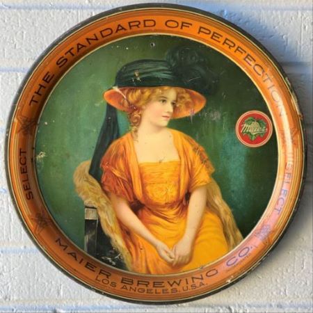
Maier Brewing Co.
Los Angeles, CA
13" Inverted Pie
13" Inverted Pie


Non-Beer Related & Non-Tray Uses


Jos. Lauer Brewing Co.
Reading, PA

Royal Brewing Co.
Weston, MO
General
There is a bit of a debate whether this is really a stock design or not. We are aware of two different examples, one from Maier Brewing of Los Angeles, CA and a second one from International Brewing of Buffalo, NY. The twist here is that the Maier example and the International Brewing example are from two different manufacturers (K&S and Niagara Litho of Buffalo New York), so one might assume that this was another short-lived stock design, perhaps due to copyright issues like K&S’s “Rose Girl.” However, the Maier example (which is marked K&S) does often carry a copyright date of 1909—long after the copyright infringement case involving advertising of Bleistein v. Donaldson Lithographing Co. was settled in 1903. To our knowledge, the International Brewing example from Niagara does not have a copyright date). So can we really call this a stock design if the only examples come from two different manufacturers for two different issuers?
We should note that we’ve also come across paper litho versions - see non-tray section below. The art is attributed to artist Leon Moran, with a copyright attributed to Kaufmann & Strauss. Interestingly it also states that it was printed in Germany. Kaufmann & Strauss started primarily as lithography importers (that is how they are listed in 1880s and early 1890s directory listings). We should further note, that we have seen a few paper litho examples with advertising text (included in the pictures below) although to our knowledge not having Moran's signature noted.
Leon (John Leon) Moran (1864-1941) was born in Philadelphia and made his reputation as a figure painter, although he also painted landscapes. Moran's father, the painter Edward Moran, was his first tutor. Moran continued his studies at the National Academy of Design in New York City. In the late 1870s he made European visits and also studied at the London and Parisian Academies. In 1883 he settled in New York and established a studio there. He exhibited frequently at the American Watercolor Society and the National Academy of Design in New York and was a member of the American Watercolor Society and the Plainfield Art Association of New Jersey. From works attributed to him that we were able to find, it appears he produced both “serious art paintings,” as well as more commercially oriented works such as this one.
Compared side by side, there are fewer differences between the Niagara and K&S versions than there are between the K&S and Beach versions of “Rose Girl." Everything about the pose, the clothing, her hat, the chair she is sitting in, the background, and even the line details and font of the advertising text on the rim are the same (obviously the content of the text is different). The only discernable differences are that the K&S version is a convex 13” inverted pie shape, while the Niagara version is a 12” straight-side dish; and the design of the small logo for each brewery that appears on the face at 2:30.

International Brewing Co.
Niagara Litho of Buffalo
12" SS Dish
Niagara Litho of Buffalo
12" SS Dish
Maier Brewing Co.
Kaufmann & Strauss
13" Inverted Pie
Kaufmann & Strauss
13" Inverted Pie
Standard of Perfection


Buffalo Brewing Co.
H.D. Beach
13.5" x 16.5" Inverted Pie
H.D. Beach
13.5" x 16.5" Inverted Pie
Buffalo Brewing Co.
Kaufmann & Strauss
13" Plate
Kaufmann & Strauss
13" Plate
Rose Girl
Although Niagara didn’t appear to be a significant manufacturer of trays, they did produce several other non-stock trays, primarily in the 1930s and 1940s, mostly for upstate New York brewers Niagara was a significant lithographer that operated from 1896 into the 1990s and is responsible for printing a variety of lithographic products to include: chromolithographs, trade cards, art prints, seed packets, medicine labels, tourist cards, and most prominently, much of the Coca-Cola cardboard signs from 1930-1940. Since Maier operated under that name from 1907-1920 and International Brewing operated under that name from 1894-1920, and neither tray contains any other clues (such as a particular brand that could be used to narrow down the date range) its unclear who copied whom.
The simplicity of the design gives little away regarding the intent of what is being portrayed. Obviously attractive young women were a popular theme of the time. Her attire appears a little more contemporary than Meek’s “Victorian ladies”, although the large hat does appear to be a holdover from earlier eras. Both her body language and the black hat suggest the possibility of mourning, although the bright orange dress would seem to be out of line with that. Symbolically, the color orange is associated with energy, happiness, enthusiasm, and excitement, none of which seems to be relevant or evident in the scene depicted. Nothing else in the design provides much of a hint. To our knowledge, neither K&S not Niagara’s versions carry an artist signature (although the K&S paper litho version does as noted above).
Size, Shape and Advertising Placement
As previously mentioned, this design appears in either a 13’ convex pie shape (the K&S examples) or a 12” straight-side dish version (Niagara). In both cases, advertising text appears on the rim in black and no currently known examples feature advertising text on the face other than the small round logo that appears near the edge of the image at roughly 2:30. Interestingly, both carry the same advertising tag line on the rim “The Standard of Perfection”—which seems to have been common in K&S stock designs. We speculate that the reason there are no other examples other than Maier and International Brewing is because there was some sort of litigation that resulted in a cease and desist order (probably to Niagara) and while that legal action was pending, K&S was enjoined from further use beyond the Maier account.
Price
The K&S Maier examples far outnumber the Niagara International Brewing examples, probably on the order of four to one. For some reason, the K&S Maier ones did not hold up so well and most examples are average condition or below, fetching prices in the mid-double to low triple figures range. Better examples do range from the mid-triple figures to low four figures. The Niagara International Brewing versions similarly didn’t seem to hold up well, and prices seem to be in the same range, although somewhat higher on average. We have not seen an example that’s well above average that compares with the best K&S Maier version; the highest prices we’ve seen for a Niagara International Brewing version has been in the upper triple figures.
Niagara Litho of Buffalo


Edward Moran Lithograph
Printed by K&S in Germany
Printed by K&S in Germany

